Categories
David Bailly vs deadly hands of commercial portraitists

Figurative art is often undervalued in the art world. It is partly due to the rise of “bad figurative”, as described by Dean Kissicik in an article for the Spectator: “Pleasant enough, but mediocre at heart (…) paintings of nothing. Watered-down, cordial, dull subjectivities.” Portraiture is even more controversial, especially the official kind: the internet is full of appalling presidential and royal portraits. According to Edward Goldman, the problem is that whereas a few centuries ago, those kinds of portraits were painted by the very best craftsmen, now they’re “executed by the deadly hands of commercial painters”.
David Bailly
One of those excellent craftsmen was David Bailly (1584-1657), whose portraits I had the pleasure of seeing last weekend at the Museum De Lakenhal in Leiden. A little older and, especially these days, much less well-known than Rembrandt, he was a famous painter in Leiden in the first half of the 17th century. Bailly’s portraits, besides being excellent representations of the sitters, are all imbued with memento mori symbolism: soap bubbles, candles, skulls, hourglasses, burning or extinguished candles and other symbolic objects remind us of the transience of life and impermanence of things such as beauty, wealth, art and knowledge.
Bailly’s most famous painting is Vanitas still life with portrait of a young painter from 1651, which has been the subject of not just academic studies, but scientific research — x-ray scans have revealed different portraits that had been painted over and different positions of various objects in the painting. It is indeed a fascinating work, where the artist had painted himself at two different stages of life, alongside his gravely ill wife, a grisaille of a woman (perhaps symbolising the wife’s ghost?), a figure of Saint Stephen bound to a tree and pierced with arrows, a print of Franz Hals’s 1626 painting, The Lute Player, and a picture of a bearded man who features in another painting of the artist.
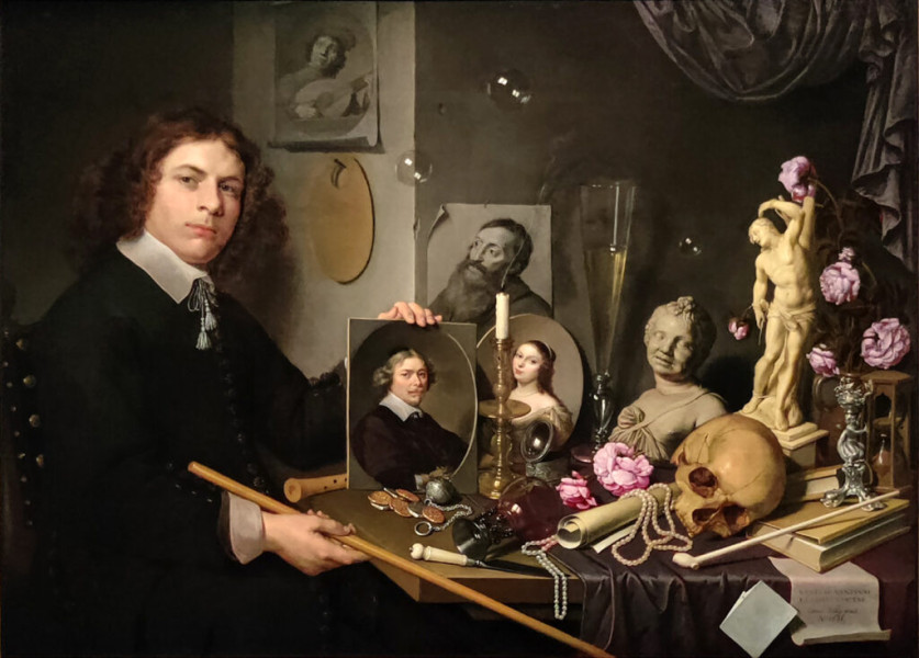
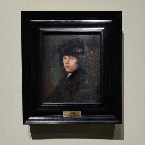
My personal favourites, however, are his tronie paintings, a type common in Dutch Golden Age painting and Flemish Baroque painting, intended as a study of expression, type, physiognomy or an interesting character. His Young Man with a Black Beret from 1637 (who, incidentally, happened to be included in Vanitas still life with portrait of a young painter before being painted over) looks almost modern. Simple in its composition and palette, the portrait focuses on the man’s ponderous gaze.

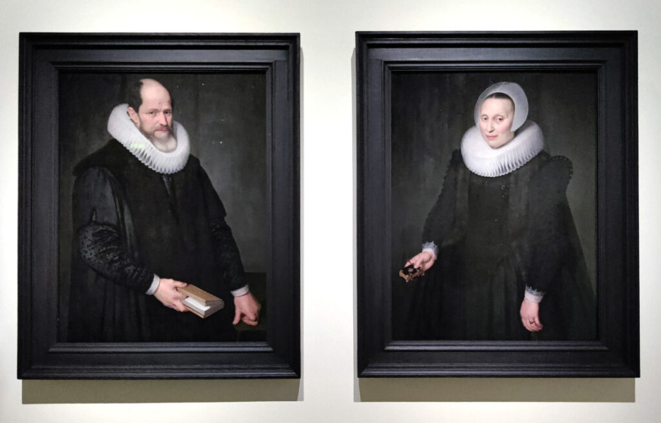
For a 17th century painter, Bailly was also quite playful — several of his portraits seem to be oval panels leaning against the wall. He was excellent both at these informal facial studies, rendered in different media, and the official portraits of noblemen. Despite the elaborate formal clothing, there too, the emphasis is on the sitter’s look and character.
The good, the bad and the ugly
What is it that makes the art of portrait painting so hard? The answer is: the balance, incredibly difficult to reach. On one hand, there has to be likeness, but a photorealistic rendering ends up being kitsch. Concealing imperfections and beautifying takes the authenticity away, but you don’t want to emphasise the flaws and end up with a caricature. In order to stand out, portraits need to have a soul, a touch of individuality, but not to the point that the portrait stops being about the person it’s presenting. When speaking of portrait painting, critic John Russell wrote in 1967: “The painter has to tread with one foot on the ground that is common to all of us, and with the other on ground that no one has essayed before. Without the one, the picture could not be read; without the other, it would be at best a meritorious re-make.”
Regardless of the level of technical skills, not every painter is capable of painting good portraits. But too many have been deluding themselves that they are — and unfortunately, many of them are respected enough as artists to get away with poor jobs. Let’s take two examples: a skillful portrait of John F. Kennedy by Aaron Shikler from 1971 and a portrait of Catherine, Duchess of Cambridge by Paul Emsley, which the Sunday Times Art Critic Waldemar Januszczak called “disappointing“, and Michael Glover from the Independent — “catastrophic“. Guardian readers weren’t any more sympathetic: “It looks like one of those What Will You Look Like in 15 Years Facebook things”, “The only thing it truly captures is an unpleasant smirk which is the least attractive thing about her”, “She looks like she has a mouthful of skittles”.


The Kennedy portrait, on the other hand, is striking for many reasons. Firstly, the composition: Kennedy is standing with arms crossed and eyes downcast, his head bowed. “I wanted to show him as a president who was a thinker,” Shikler told The Washington Post in 1971,”A thinking president is a rare thing.” Shikler also said that the president’s widow, Jackie, didn’t want him to look “the way everybody else makes him look, with the bags under his eyes and that penetrating gaze. I’m tired of that image.” Secondly, the colour palette — subdued and understated. Compare it with the John Howard Sanden’s portrait of George Bush from 2010, which looks like it was painted not from life but from a wooden mannequin used in art classes, and you’ll see the difference.


The desire to be original and innovative can lead to comical results. The portrait of the Danish royal family by Thomas Kluge, which is a reference to a famous 1883 portrait of King Christian IX of Denmark surrounded by his royal progeny, looks to me like a Photoshop-rendered thriller movie poster (which is a shame, because Kluge’s portrait of Queen Margrethe II of Denmark is quite successful, even though I’m generally not keen on photorealism). Though the best example of ambition getting ahead of the artist’s ability is the portrait of Prince Philip, Duke of Edinburgh, by Stuart Pearson Wright (Ok yes, the Duke is a rather ugly character, but let’s assume the painting was not meant to be a reflection of the sitter’s personality). The title of the painting is equally pretentious as the style: Homo sapiens, Lepidium sativum and Calliphora vomitoria, translates to “a wise man, some cress, and a bluebottle” (the last one, incidentally, coming from the vanitas tradition our David Bailly submitted to). And the style is… just awful. If this was meant to be a mockery, then the painter’s succeeded. Though I have to give it to him — the likeness is there.
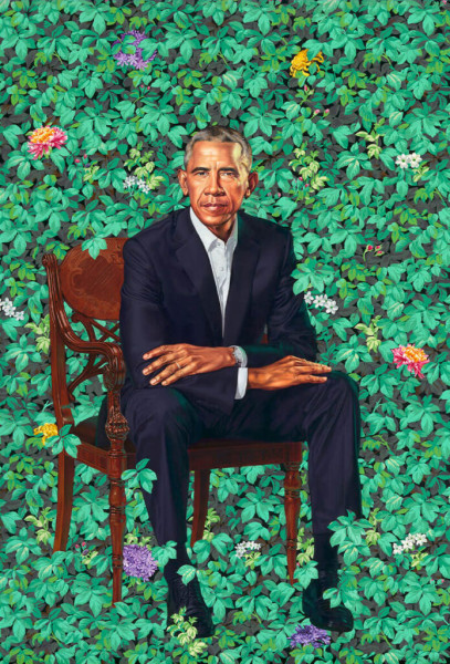
And sometimes you have the opposite: great style and no likeness at all. Take Elizabeth Peyton’s Prince Harry in Westminster, November 1997 from 1998. As we know, to an extent, every painter paints himself but in this portrait, Harry does look a lot more like Peyton than himself. If she had called it A portrait of a boy, I would have no objections. But because it is a portrait, it has to bear resemblance to the sitter and as much as I like Peyton’s work, I think this is a rather unsuccessful piece. But while we can argue that Peyton’s loose brushstrokes lessen the importance of realism, in a meticulously painted portrait of Barack Obama by Kehinde Wiley from 2018, there is no excuse for problems with resemblance. And yet it is the painting’s weakest point. While one might appreciate the unique setting and concept of the portrait, the former president just doesn’t look like himself, not to mention the portrait completely fails to capture his warmth and openness.


Artists like to draw attention to themselves and many find enjoyment in causing a stir. I don’t mind subversiveness if there’s a genuine thought process behind it and the result is good. Looking at these two works, Kim Don Yoo’s portrait of Princess Diana, and George Condo’s portrait of the Queen Elizabeth II, the winner is obvious. The former, made up of lots of smaller portraits of Queen Elizabeth II, brings to to mind Andy Warhol, but unlike the American artist’s work, it is not a print — the image was painted entirely by hand. The latter looks like a Cabbage Patch doll and offers nothing except perhaps humour.
Edward Goldman was not exactly right saying that prior to the modern times, official portraits were painted by the best. We can find many examples of botched portraits across the centuries but I’m under the impression that in the 21st century, the ratio of good portraits to bad portraits is skewed in favour of the latter. Which is why exhibitions such as the Lakenhal show are a good antidotum to the flood of ugliness.
Subscribe to my newsletter to receive notifications of new posts. To see my portraits, please click here.